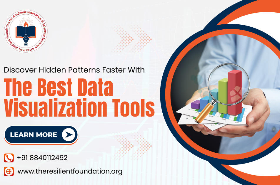
Today, we all use a lot of data, at work, in school, or even in daily life. But if we cannot understand this data quickly, it becomes confusing. This is why the best data visualization tools are so helpful. They turn numbers and facts into pictures, like charts and graphs, that are easy to see and understand. Because of that, people can make better and faster decisions. These tools are useful for everyone, not just experts. Also, many people now join online workshops to learn how to use these tools in simple ways. If we use the right tools, we can understand more and make smart choices.
Finding Hidden Patterns with Data Visualization
Sometimes, there are important ideas hidden in big data. We may not see them right away. But with data visualisation, these ideas become easy to spot. Here’s how it helps:
- See Trends Clearly: Line charts or bar graphs can show how things change over time. This helps people understand if something is going up or going down.
- Find Unusual Data: Some numbers may be too high or too low; hence, tools like scatter plots help us find these quickly. Moreover, these are called outliers.
- Understand Connections: Bubble charts or other visual tools help us see if two or more things are linked. This helps in planning and decision-making.
- Compare Different Groups: Pie charts or simple bar charts show differences between groups. As a result, we can compare things more easily.
- Tell a Clear Story: Good visuals help everyone understand the data quickly; thus, that is why many training programs teach how to tell stories using data.
Best Data Visualization Tools for Smarter Insights
Many tools help us see and understand data better. The best data visualization tools are easy to use and give clear results. Here are the most useful ones:
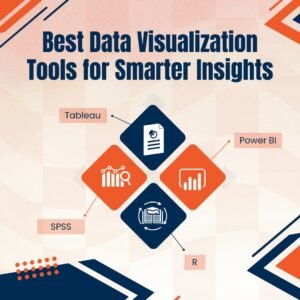
- Tableau: This tool helps you make charts and graphs by just dragging and dropping data. It is fast and easy to use. Also, it works with Excel, Google Sheets, and more. Many online workshops teach how to use Tableau well.
- Power BI: This tool is from Microsoft. It helps in making reports and tracking numbers. It is used by many companies. If you join Tableau and Power BI training sessions, you will learn how to make dashboards and track data.
- R: The R programming language is for people who want to write code. It helps create special charts and is good for deep data work.
- SPSS: This tool is used in schools, research, and social work. It is simple to use and helps people study data and make charts easily.
Using R and SPSS for Advanced Data Analysis
When we want to go deeper into the data, tools like the R programming language and SPSS are very helpful. They are good for advanced work. Here’s how they help:
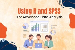
- Create Your Charts: R lets you write your code to make charts your way. Because of that, you can make visuals that are just right for your data.
- Deep Data Tests: SPSS helps you study the data with strong tests like regression; also, it is good for people in education or research.
- Make Easy-to-Read Reports: These tools can make reports that others can understand. Also, teams can look at them and make smart decisions.
- Work with Other Tools: R and SPSS can be used with Excel and also with the best data visualization tools like Tableau. This makes them even more useful.
- Learn from Online Classes: Today, many people learn R and SPSS by joining online workshops. These help you learn by doing real exercises.
Future Trends in Data Visualization
The way we use data visualisation is changing. New ideas are coming up all the time. Here are some trends to know:
- Smart Charts with AI Help: Some tools now use artificial intelligence. They help you choose the right chart and even show trends. Because of that, your work becomes easier.
- Charts That Work on Phones: Today, people use phones and tablets more. So, tools are now making sure that charts look good on small screens, too.
- Learn Online Easily: More and more people are joining online workshops and training programs to learn how to use these tools; thus, they are gaining valuable skills.
- Used in Many Fields: Not just tech people, but also teachers, doctors, and social workers are using these tools. Because of the tableau and Power BI training sessions, anyone can now use data easily.
Conclusion
To understand big data and find useful answers, hence, the best data visualization tools help. Moreover, with the right skills, learned through online workshops or training, anyone can use them effectively.
At Resilient Foundation, we help people learn these skills in simple ways. We offer Tableau and Power BI training sessions and lessons in the R programming language and SPSS. We make sure our sessions are easy to follow and useful for real-life work. Our goal is to help you use data visualisation to grow in your career or to help your community. If you want to learn and grow with data, we are here to support you every step of the way.