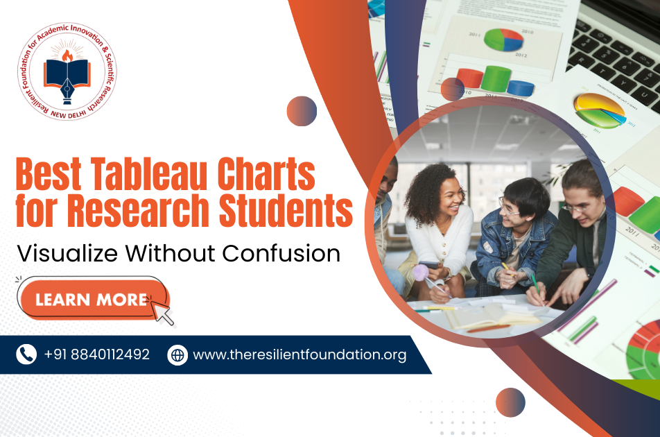
Research students often struggle to make sense of large sets of numbers and information. But if the data is not shown clearly, even the best findings can look confusing. That is why using the best Tableau charts for research makes a big difference. With the right charts, complex data becomes easy to read and understand. Tools like Tableau are not just for experts; even students can use them to explain ideas without confusion. And if you are looking to grow further, the Tableau Data Analyst certification can also help you stand out in your research journey.
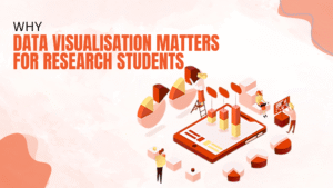
Why Data Visualisation Matters for Research Students
Clear data visuals are as important as the research itself. If your audience does not understand the results, your effort is wasted. Here’s why visualisation matters:
- Simplifies Complex Data: Big data looks less scary when you use the best data visualisation tools like Tableau.
- Builds Better Communication: Charts let you explain results fast, even to people outside your field.
- Saves Time: Instead of reading long reports, visuals help people see patterns at a glance.
- Engages the Audience: A clear graph can hold attention better than long text.
- Supports Decision-Making: If you use Tableau for researchers, your findings can lead to stronger and smarter decisions.
Because of this, students in any research workshop should learn to use these visuals to enhance their work.
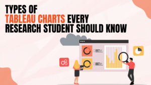
Types of Tableau Charts Every Research Student Should Know
Not all charts are the same. If you pick the wrong one, your results can be misunderstood. However, with Tableau, you can select from many chart types. The best Tableau charts for research are:
- Bar Charts: Best for comparing categories. For example, the number of students in different study groups.
- Line Charts: Good for showing trends over time. Perfect for research that tracks change.
- Pie Charts: Easy to show percentages, but best used only for small datasets.
- Scatter Plots: Useful to study relationships between two variables, which many research students need.
- Heat Maps: They show intensity of values with colours and are great when handling large data tables.
So, if you are learning through a research workshop, understanding these chart types will make your presentations much stronger. These are truly the best tableau charts for research because they give clarity to both simple and advanced findings.
Tips for Choosing the Right Tableau Chart
Choosing the wrong chart can confuse your readers. But if you pick the right one, your story becomes clear. Keep these points in mind:
- Know Your Purpose: If you want to show change over time, use a line chart.
- Think of Your Audience: If your audience is not technical, keep the chart simple.
- Avoid Overcrowding: Too much detail makes the chart hard to read.
- Use Consistent Colours: Random colours confuse people. Use soft tones for clarity.
- Test Before Sharing: Show your chart to a peer before finalising.
If you are aiming for a Tableau Data Analyst certification, these tips will help you build cleaner projects. Also, remember that choosing the right type of chart makes Tableau for researchers very effective.
Common Mistakes to Avoid While Using Tableau
Even with the best data visualisation tools, mistakes can happen. But knowing them early helps you avoid problems. Here are the most common ones:
- Too Many Charts at Once: Showing too much data makes it confusing.
- Ignoring Labels: A chart without labels is like a book without a title.
- Wrong Chart Choice: Using a pie chart for trend analysis is a big error.
- Not Checking Accuracy: Data errors lead to misleading results.
- Over-Designing: Fancy designs look nice, but reduce clarity.
Because of that, research students must stay careful. Even when you are part of a research workshop, the trainer will remind you to keep things simple in Tableau.
How Tableau Helps Research Students
The role of Tableau for researchers goes beyond just making charts. It becomes a partner in learning and sharing knowledge. Here’s how it helps:
- Makes Learning Easy: You don’t need to be a tech expert to use Tableau.
- Supports Research Goals: Whether you are studying science, business, or social work, visuals make findings stronger.
- Boosts Career Growth: With a Tableau data analyst certification, students gain extra skills useful in jobs and higher studies.
- Saves Time in Projects: Instead of wasting time on formatting, charts can be built quickly.
- Connects to Training Programs: At Resilient Foundation, we focus on helping students in every research workshop learn the best Tableau charts for research with simple methods.
Also, Resilient Foundation believes that the best data visualisation tools should not feel complex. That is why we guide students step by step so they can use Tableau without fear and present their work with confidence.