
When researchers work with large sets of numbers, it can feel confusing. Tables and lists of data are often hard to read and understand. But using Tableau for researchers makes this problem much easier to handle. Tableau turns numbers into colourful charts and graphs that make sense at a glance. This saves time and makes research work easier because you can focus on your findings instead of spending hours making charts by hand. Because of that, many researchers now explain their results faster and more clearly. Resilient Foundation helps researchers choose the best data visualisation tools so that every chart they make is useful and easy to understand.
Understanding Tableau for Research Work
Before using Tableau, it is helpful to know how it works. Here are some simple points to explain why it is so helpful for research:
- Data connection flexibility: Tableau connects to many data sources like Excel sheets, databases, and online files. This means your best tableau charts for research can use data from different places without extra work.
- Drag-and-drop interface: You can make charts just by dragging and dropping data fields. Therefore, you don’t need to know computer coding to make good charts.
- Customisable dashboards: You can put different charts together in one place. This makes your data visualisation easier to share and more organised.
- Interactive features: You can add filters, search tools, and hover details so people can explore your data themselves. This is why Tableau is one of the best data visualisation tools for research.
- Scalability: Tableau works well with both small and very large data sets. Your best tableau charts for research will work smoothly no matter the size of your project.
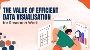
The Value of Efficient Data Visualisation for Research Work
Making charts quickly helps research work in many ways. Here is why data visualisation is so important:
- Better decision-making: The best tableau charts for research make it easy to see patterns, so people can make choices faster.
- Time savings: Tableau updates charts automatically when the data changes. Because of that, researchers can spend more time studying their findings.
- Clarity in presentations: A clear data visualisation helps people understand your work and remember it.
- Error detection: Charts can show mistakes in data that are hard to see in tables.
- Collaboration boost: You can share Tableau dashboards online so others can view or edit them. This is another reason it is one of the best data visualisation tools.
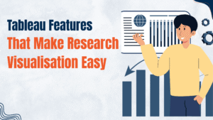
Tableau Features That Make Research Visualisation Easy
Tableau has many tools that make research work simple. Here are some useful features in Tableau for researchers :
- Variety of charts: You can make many kinds of charts, such as bar charts, line graphs, scatter plots, and heat maps. This helps you pick the best tableau charts for research for your data.
- Live data updates: Tableau can connect to live data and update your data visualisation without extra steps.
- Smart analytics: It can show trends, make forecasts, and group data to help you see patterns. Thus, your research results become deeper and more detailed with Tableau for researchers.
- Mobile accessibility: You can check or edit your charts on your phone or tablet, even when you are not at your desk.
- Integration with learning paths: If you want a Tableau data analyst certification, using these features will give you good practice with the best data visualisation tools.
Expert Opinion
“At Resilient Foundation, we believe mastering Tableau for researchers opens doors to smarter analysis, richer insights, and stronger research impact. That’s why we train scholars to use the best data visualisation tools effectively.”
Tips for Researchers to Get the Best Out of Tableau
Using Tableau well is about working smart. Here are some tips from the Resilient Foundation:
- Start simple: Use the best Tableau charts for research that match your data. Then, slowly try more complex charts.
- Clean your data first: Good data visualisation starts with correct data. Remove errors, empty rows, and repeats.
- Use filters wisely: Filters help people focus on the most important details in your chart.
- Explore training: Resilient Foundation offers training to prepare you for the Tableau Data Analyst certification. This helps you use the best data visualisation tools with confidence.
- Tell a story: Explain what the charts mean. This helps your audience understand why the data matters.